A Christian Dating App
A dating app was in the process of revamping its mobile app and wanted UX expertise to review its app to ensure it met UX best practices.
The dating app offers an experience curated for Orthodox Christians with the mission of connecting this minority group and helping them find love.
The app team consisted of a developer and designer, but the team did not conduct any UX research or vet any design decisions before launching the app, and they knew they needed some updates.
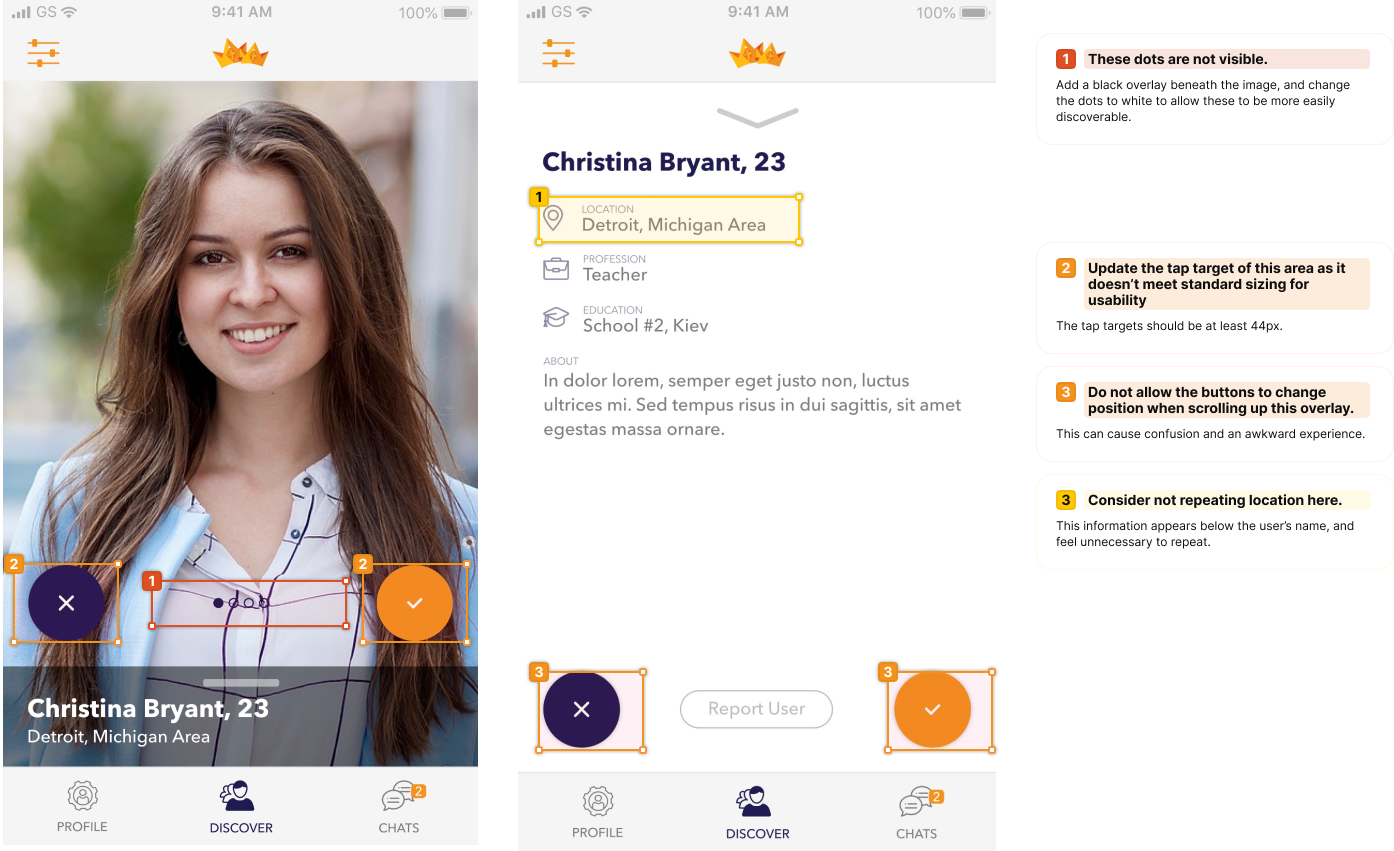
We conducted a UX audit of the app to identify areas for improvement and provided ranked recommendations for how to enhance the overall functionality and improve the experience.
Through the audit, we found several opportunities to make the experience more accessible, engaging, and enjoyable.
Our audit included a review of the app's design and user flow. We analyzed the app for the following:
Content
Design and typography best practices
Accessibility
Navigation and Structure
Before we began the audit, we needed to understand the target users for this dating app, and identified the following:
Christian singles, specifically Orthodox Christians
Ages: 18–45
With this information, we could select competitor apps, and see how this app compared to similar apps in the market in meeting industry standards along with UX best practices.
Next, we reviewed and documented the app's primary user flow to understand the journey our target user will take to begin the evaluation. This also helps us identify early on any areas of confusion or friction in the information architecture and in the primary flow of the app.
Using this scale, we ranked issues from a scale of 0 to 5 of severity to provide easy visualization into the severity and urgency of the issue and recommendation.
No issues found
Minor issue: There is a small problem or error, but it doesn't significantly impact the system's functionality or usability.
Moderate issue: There is a problem or error that affects the system's functionality or usability to a noticeable extent.
Major issue: There is a significant problem or error that impacts the system's functionality or usability to a great extent.
Critical issue: There is a critical problem or error that severely impacts the system's functionality or usability and requires immediate attention.
Urgent issue: There is an urgent problem or error that renders the system unusable and requires immediate attention to restore functionality.
Content
We reviewed each screen for its content to evaluate if things are written in a way the target user would recognize and understand, and ranked issues found using the scale of severity.
Design & Typography
Next, we reviewed each screen based on design, discoverability, and typography.
The audit also uncovered opportunities for additional learning and feature enhancements.
Accessibility
We also ran screens through a contrast checker and identified areas of improvement.
The audit resulted in a list of prioritized and actionable recommendations that provided the team with clarity and insight into how to improve the experience.
What we delivered:
Detailed audit report presentation with actionable and prioritized design recommendation.
Call upon the
UX Oracles.
Want a UX audit of your own app or website? Leave us your information and we’ll reach out!


